Investigate content of QA pawianHists.root file#
This notebook shows how to to investigate the content of a pawianHists.root file that is the result of the QA step in Pawian. We make use of the pawian.qa module of Pawian Tools.
Draw contained histograms#
A pawianHists.root comes with several histograms of several PWA distributions—one for data, one for the fit, and one for Monte Carlo. The PawianHists class contains a few methods to quickly plot these ‘contained’ histograms.
First, open a pawianHists.root file as a PawianHists object. In this example, we use the ROOT file that is provided in the tests of the pawian.qa module.
from os.path import dirname, realpath

import pawian
from pawian.qa import PawianHists

sample_dir = f"{dirname(realpath(pawian.__file__))}/samples"
filename = f"{sample_dir}/pawianHists_ROOT6_DDpi.root"
pawian_hists = PawianHists(filename)
Now it is quite easy to see which histograms are contained in the histogram file.
from pprint import pprint

histogram_names = pawian_hists.histogram_names
print(f"Number of histograms: {len(histogram_names)}\n")
pprint(histogram_names)
Number of histograms: 57

['DataThetaHeli_pip_FrompipD0Dm',
 'DataPhiHeli_pip_FrompipD0Dm',
 'DataThetaGJ_pip_FrompipD0Dm',
 'DataPhiGJ_pip_FrompipD0Dm',
 'McThetaHeli_pip_FrompipD0Dm',
 'McPhiHeli_pip_FrompipD0Dm',
 'McThetaGJ_pip_FrompipD0Dm',
 'McPhiGJ_pip_FrompipD0Dm',
 'FitThetaHeli_pip_FrompipD0Dm',
 'FitPhiHeli_pip_FrompipD0Dm',
 'FitThetaGJ_pip_FrompipD0Dm',
 'FitPhiGJ_pip_FrompipD0Dm',
 'DataThetaHeli_pip_FrompipD0',
 'DataPhiHeli_pip_FrompipD0',
 'DataThetaGJ_pip_FrompipD0',
 'DataPhiGJ_pip_FrompipD0',
 'McThetaHeli_pip_FrompipD0',
 'McPhiHeli_pip_FrompipD0',
 'McThetaGJ_pip_FrompipD0',
 'McPhiGJ_pip_FrompipD0',
 'FitThetaHeli_pip_FrompipD0',
 'FitPhiHeli_pip_FrompipD0',
 'FitThetaGJ_pip_FrompipD0',
 'FitPhiGJ_pip_FrompipD0',
 'DataThetaHeli_pip_FrompipDm',
 'DataPhiHeli_pip_FrompipDm',
 'DataThetaGJ_pip_FrompipDm',
 'DataPhiGJ_pip_FrompipDm',
 'McThetaHeli_pip_FrompipDm',
 'McPhiHeli_pip_FrompipDm',
 'McThetaGJ_pip_FrompipDm',
 'McPhiGJ_pip_FrompipDm',
 'FitThetaHeli_pip_FrompipDm',
 'FitPhiHeli_pip_FrompipDm',
 'FitThetaGJ_pip_FrompipDm',
 'FitPhiGJ_pip_FrompipDm',
 'DataThetaHeli_D0_FromD0Dm',
 'DataPhiHeli_D0_FromD0Dm',
 'DataThetaGJ_D0_FromD0Dm',
 'DataPhiGJ_D0_FromD0Dm',
 'McThetaHeli_D0_FromD0Dm',
 'McPhiHeli_D0_FromD0Dm',
 'McThetaGJ_D0_FromD0Dm',
 'McPhiGJ_D0_FromD0Dm',
 'FitThetaHeli_D0_FromD0Dm',
 'FitPhiHeli_D0_FromD0Dm',
 'FitThetaGJ_D0_FromD0Dm',
 'FitPhiGJ_D0_FromD0Dm',
 'DatapipD0',
 'MCpipD0',
 'FitpipD0',
 'DatapipDm',
 'MCpipDm',
 'FitpipDm',
 'DataD0Dm',
 'MCD0Dm',
 'FitD0Dm']
As can be seen, the names can be grouped by Fit, Data, and MC. The property unique_histogram_names helps to identify which different types there are.
unique_names = pawian_hists.unique_histogram_names
print(f"Number of different histogram types: {len(unique_names)}\n")
pprint(unique_names)
Number of different histogram types: 19

['ThetaHeli_pip_FrompipD0Dm',
 'PhiHeli_pip_FrompipD0Dm',
 'ThetaGJ_pip_FrompipD0Dm',
 'PhiGJ_pip_FrompipD0Dm',
 'ThetaHeli_pip_FrompipD0',
 'PhiHeli_pip_FrompipD0',
 'ThetaGJ_pip_FrompipD0',
 'PhiGJ_pip_FrompipD0',
 'ThetaHeli_pip_FrompipDm',
 'PhiHeli_pip_FrompipDm',
 'ThetaGJ_pip_FrompipDm',
 'PhiGJ_pip_FrompipDm',
 'ThetaHeli_D0_FromD0Dm',
 'PhiHeli_D0_FromD0Dm',
 'ThetaGJ_D0_FromD0Dm',
 'PhiGJ_D0_FromD0Dm',
 'pipD0',
 'pipDm',
 'D0Dm']
Now, let’s have a quick look at one of these histograms:
import matplotlib.pyplot as plt

pawian_hists.draw_histogram("DatapipDm")
plt.show()
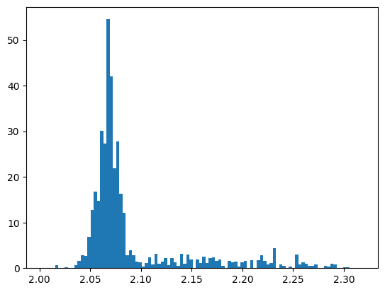
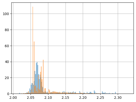
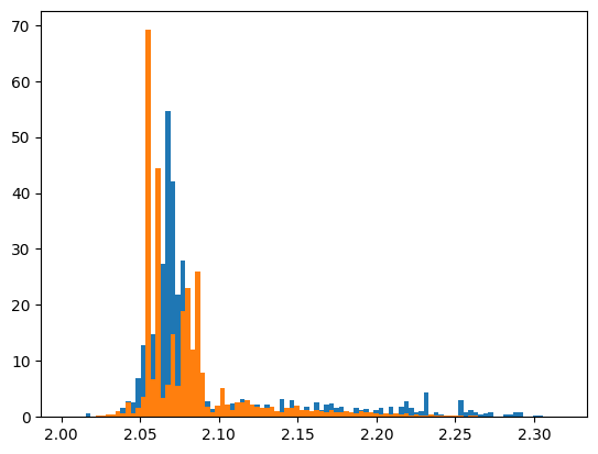
This is quite ugly and, frankly speaking, not very interesting, because we actually want to assess the quality (QA) of our fit. Of course, you could just plot the histogram of the fit in the same figure, but that would still need some polishing to make it look nicer. And of course, you have to pay attention to use the correct names…
pawian_hists.draw_histogram("DatapipDm")
pawian_hists.draw_histogram("FitpipDm")
plt.show()
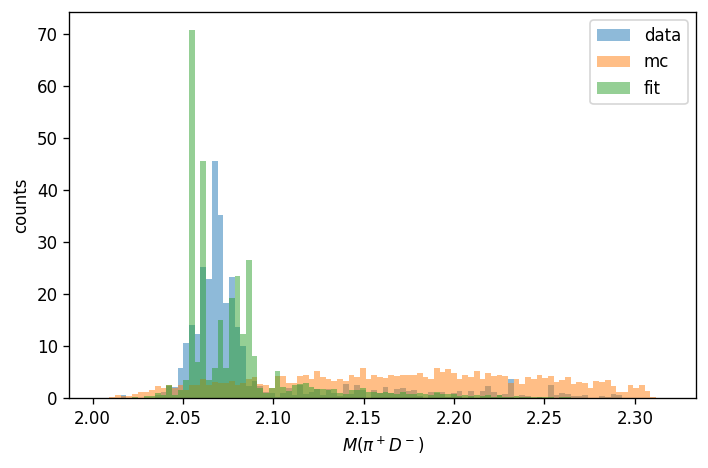
There is an easier way to do it. For a nice comparison plot, we use the draw_combined_histogram() method. This method works in the same way as draw_histogram(), but it needs one of the unique_histogram_names().
Note how this method can also take arguments from matplotlib.pyplot.hist to make it look fancier, such as density to make the plots normalized. The histograms in the figure have been embedded with titles, so that we can nicely generate a legend as well.
Another thing to note: this time we draw the histogram on an Axes (subplot()), instead of the default pyplot module, as to give us the means to modify the figure a bit.
We also applied a little trick here: we used convert() from the pawian.latex module to convert the histogram name to a LaTeX string.
histogram_name = "pipDm"
fig = plt.figure(tight_layout=True, figsize=(6, 4), dpi=120).add_subplot()
pawian_hists.draw_combined_histogram(
    histogram_name, plot_on=fig, density=True, alpha=0.5
)
plt.ylim(bottom=0)
plt.legend()

from pawian.latex import convert

plt.xlabel(f"$M({convert(histogram_name)}$)")
plt.ylabel("counts")
plt.show()
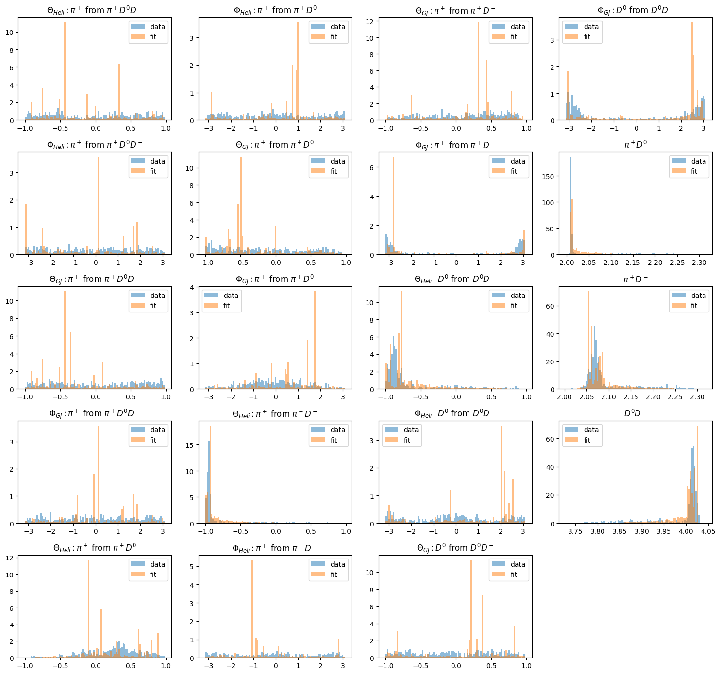
Finally, a thing you may want to have done immediately is to generate an overview of all histograms. This can be done with the draw_all_histograms() method. It takes some time to draw them all, but it’s worth it!
By the way, notice how the Monte Carlo samples have been hidden by using mc=False. You can do the same with data=False and/or fit=False.
This method again takes arguments from matplotlib.pyplot.hist(), so feel free to play around and modify the figures.
fig = plt.figure(tight_layout=True, figsize=(15, 14))
pawian_hists.draw_all_histograms(
    mc=False, plot_on=fig, legend="upper right", alpha=0.5, density=True
)
plt.show()
Plot vector distributions#
A pawianHists.root file also contains trees with the original Lorentz vectors of the data and of the phase space sample. The weights of the phase space sample represent the intensity of fit result, so you can use those to draw the fit distribution.
The PawianHists class wraps its lorentz vectors in a DataFrame and you can access its members with the the DataFrame accessors provided by the pawian.data module.
print(pawian_hists.data.pwa.mass.mean())
print("\nAverage data weight:", pawian_hists.data.pwa.weights.mean())
print("Number of data events:", len(pawian_hists.data))
print("Number of MC events:", len(pawian_hists.fit))
Particle
D-     1.86961
D0     1.86484
pi+    0.13957
dtype: float64

Average data weight: 0.7587419
Number of data events: 501
Number of MC events: 2505
The main thing we are interested in, is to compare the fit distributions with those of data. This is the same as with the histograms above, but now we can take an arbitrary binning using the functionality offered by pandas.DataFrame.
data = pawian_hists.data
fit = pawian_hists.fit
piDm_data = data["pi+"] + data["D-"]
piDm_fit = fit["pi+"] + fit["D-"]

plot_options = {"bins": 150, "density": True, "alpha": 0.5}
piDm_data.pwa.mass.hist(**plot_options, weights=data.pwa.intensities)
piDm_fit.pwa.mass.hist(**plot_options, weights=fit.pwa.intensities);